This web-based app is a tool I developed to make interactive data visualization. Examples below show an interactive Volcano Plot (Fig. 1), a Bar Plot (Fig. 2), and its raw data (Fig. 3). Those diagrams are related to Cell Biology research yet to be published.
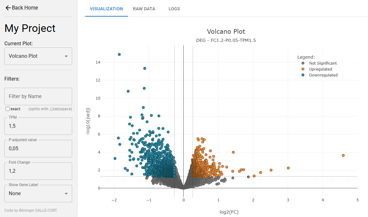
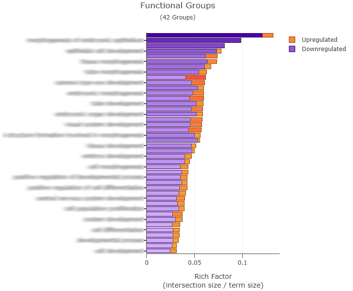
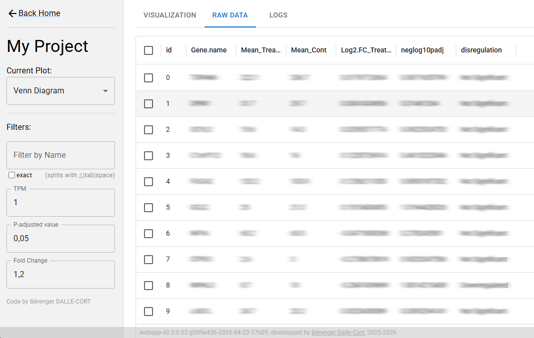
Those plots aren’t static. Indeed, the UI allows users to filter the data interactively, that’s why you see on the left side of the UI some input fields like TPM (transcripts per million), P-value, and FC (Fold Change).
This app has been developed to produce a standalone HTML page on a per-customer basis. Each build can include several projects, each of them including one or more interactive visualizations.
For each project, data is first normalized/transformed/cleaned using Python (Pandas, NumPy), and integrated as a JSON file into the app.
Many types of plots have been used for this app; they all rely on Plotly.js and D3.js libraries.

Plotly.js / D3.js / TypeScript / Python